Introduction
Like maps, charts provide a visual way to explore and understand data. Used alongside maps in ArcGIS Pro, charts help uncover patterns, trends, and relationships, adding context and clarity to the analysis. They are also an effective way to communicate insights clearly and efficiently to the audience.
In this blog post, we’ll take a deeper look at the different types of charts available in ArcGIS Pro and explore when and why to use each one to get the most out of the data.
Basic Terminology
Before moving forward, let’s discuss some of the basic terminologies related to charts.
a. Categorical Data: Categorical data refers to values that are grouped into distinct categories rather than measured on a continuous scale. Common examples include attributes such as gender, land‑use type, or education qualification. In the context of ArcGIS Pro, categorical data is most often stored in fields with a string data type. However, depending on the nature of the dataset, categories may also be represented numerically and stored in integer fields. For instance, in a housing dataset, the number of bedrooms is a finite set of discrete categories (e.g., 1, 2, 3, 4 bedrooms) and is typically stored as an integer, even though it is used categorically for visualization and charting purposes.
b. Continuous Data: Also referred to as numerical data, represents values that can take any value within a defined range or interval. These values are measurable and not restricted to fixed categories. Common examples include temperature recorded throughout a day, elevation values, rainfall amounts, or the height of individuals in a population. In the context of ArcGIS Pro, continuous data is typically stored in numeric fields such as float, double and integer allowing for greater precision and range.
Having a clear understanding of the distinction between categorical and continuous data is essential for effective data visualization. Charts convey insights most effectively when the underlying data types are well understood and the chosen chart type appropriately represents the nature and distribution of the data aiding in analysis.
Let’s now discuss different types of charts in more detail:
a. Box Plot – A Box Plot, also known as a box‑and‑whisker plot, is used to understand the distribution of continuous (numeric) data. It provides a compact visual summary of key statistics, making it useful for comparing distributions and identifying variability or outliers. Following is the representation of box plot:
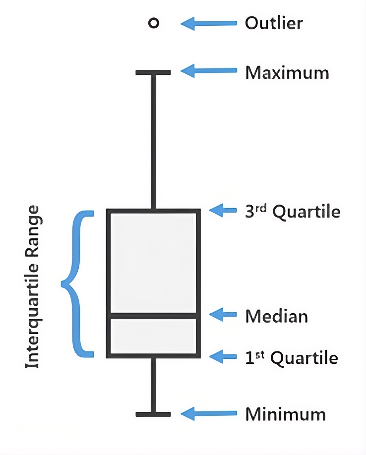
A box plot displays five statistics: the minimum, first quartile (Q1), median, third quartile (Q3), and maximum. The box represents the Interquartile Range (IQR), which contains the middle 50 percent of the data, while the median is shown as a line inside the box.
The size of the IQR indicates variability—larger boxes reflect widely spread values, while smaller boxes suggest values clustered around the median. In ArcGIS Pro, box plots are especially effective for comparing numeric fields such as income, elevation, or population density across different categories or geographic areas, helping quickly reveal patterns and potential outliers.
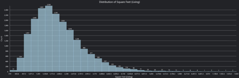
b. Histogram – A Histogram is used to summarize the distribution of a single continuous variable by showing how frequently data values occur within a dataset. It is particularly effective for visualizing the shape of the data distribution, while also helping to understand its central tendency, spread, and overall range.
One important aspect of histograms is the choice of bin size. Too few bins can oversimplify the data and hide important patterns, while too many bins can make the chart noisy and difficult to interpret. ArcGIS Pro allows users to adjust bin size and count, making it easier to experiment and reveal meaningful trends.
In the example shown below, a histogram has been generated to examine the distribution of living room area (measured in square feet) in a housing dataset. This visualization helps identify the most common room sizes, assess variability across homes, and determine whether most properties fall within a narrow size range or are widely spread. Such insights are especially valuable during exploratory data analysis in ArcGIS Pro.
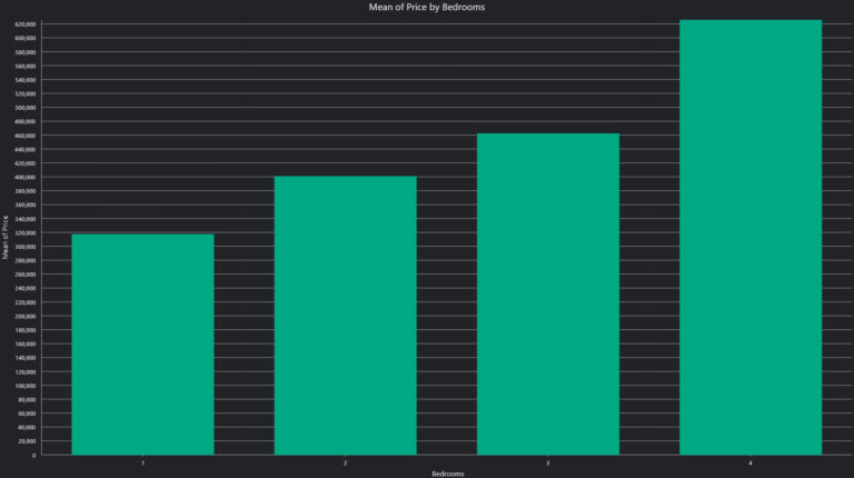
c. Bar Chart – A Bar Chart is commonly used to compare values across different categories. In simple terms, it helps establish a relationship between a categorical variable and a continuous (numeric) variable, making it easy to see how one changes relative to the other.
In a bar chart, the categorical variable is displayed along the x‑axis, while the continuous variable is plotted on the y‑axis. In ArcGIS Pro, users also have the flexibility to aggregate the numeric field using summary statistics such as mean, minimum, maximum, or sum, depending on the analytical requirement.
In the example shown below, a bar chart is used to illustrate the relationship between the number of bedrooms (categorical variable) and the average house price (continuous variable). From the chart, it can be clearly observed that the average price increases as the number of bedrooms increases, highlighting a positive relationship between these two variables. This makes bar charts especially effective for comparing trends and drawing insights across categories in spatial and non‑spatial datasets within ArcGIS Pro.
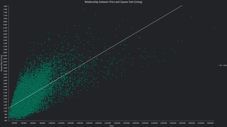
d. Scatter Plot – A Scatter plot is used to compare values between two numeric fields. In other words, it is best suited for analysing the relationship between two continuous variables, helping to reveal patterns, trends, or correlations in the data.
In a scatter plot, each point represents a pair of values from the two variables being compared. By observing how these points are distributed across the chart, users can identify whether a relationship exists and, if so, determine its nature (e.g., positive, negative, or no correlation).
In the example shown below, a scatter plot is used to illustrate the relationship between house price and living room area (measured in square feet). The plot clearly shows a positive relationship between the two variables—as the living room area increases, the price of the house also tends to increase. This indicates that the size of the living space is a key factor influencing property price.
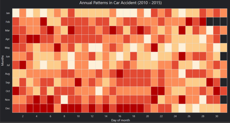
e. Calendar Heat Chart – A Calendar heat chart offers a unique way to visualize temporal data by revealing patterns in when events occur over time—whether across days of the week, months, or even entire years. By summarizing multiple time periods into a single calendar view, this chart helps highlight recurring trends and periods of higher or lower activity.
Each cell in the calendar represents a specific date, with color intensity used to indicate the magnitude of activity or frequency of events. This makes it easy to quickly identify patterns such as peak days, seasonal trends, or periodic spikes.
In the example shown below, a calendar heat chart is used to analyse accident data across multiple years, helping identify problematic or high‑risk days where incidents occur more frequently.
Different types of charts serve different purposes, and choosing the right one depends on the specific analysis question you are trying to answer. Whether it is understanding distributions, comparing categories, identifying relationships, or uncovering temporal patterns, each chart type offers a unique way to interpret data.
By selecting the most appropriate visualization in ArcGIS Pro, you can not only present your data more effectively but also derive deeper insights and tell a more compelling story through your analysis.

Vikhyat, a Senior Analyst, combines strong analytical skills with a customer-focused approach to drive operational excellence and deliver high-quality business solutions.