Some of the biggest challenges organizations face today are data fusion and discovery: how to quickly find the right information and analyse it in the right context. This blog will introduce ArcGIS Knowledge, the knowledge graph and graph analysis capability for ArcGIS Enterprise and ArcGIS Pro that makes it easy to create, discover, and explore connections in data.
Let us understand the capabilities of ArcGIS Knowledge with the help of an example of Ration card transactions. To ensure the food security of vulnerable population, especially migrant workers, Government of India launched a digital transformation model called “One Nation One Ration Card”. This empowers the ration card holders to pick-up their food grains from any fair price shops across India. These transactions are available as relational databases or to simply put available as rows and columns. Here I have the csv file of over 23000 ration cards in Just one month – That is about 1.4 lakh transactions.
Hidden within this excel sheet, there is a lot of valuable information – both spatial and non-spatial. How do we bring out the relationships that exist within the data, a connection that is going to tell more of the story?
This is where Knowledge Graphs can help. ArcGIS Knowledge is a new optional server capability that allows organizations to connect, explore, and analyse their data within knowledge graphs. By visualizing and analysing the relationships, organizations can discover new insights and make more informed decisions.
So, how do we do this? Well, it starts by transforming your data into Entities & relationships.
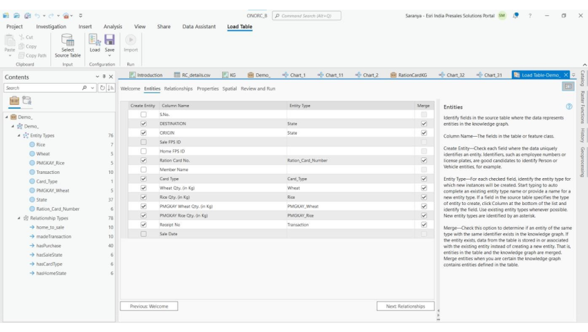
Here State names, Ration card numbers, etc are assigned as “Entities”, whereas the possible relationships such as a Ration card holder “hasHomeState” as “Relationship Types”. This can be done using “Load Table” functionality.
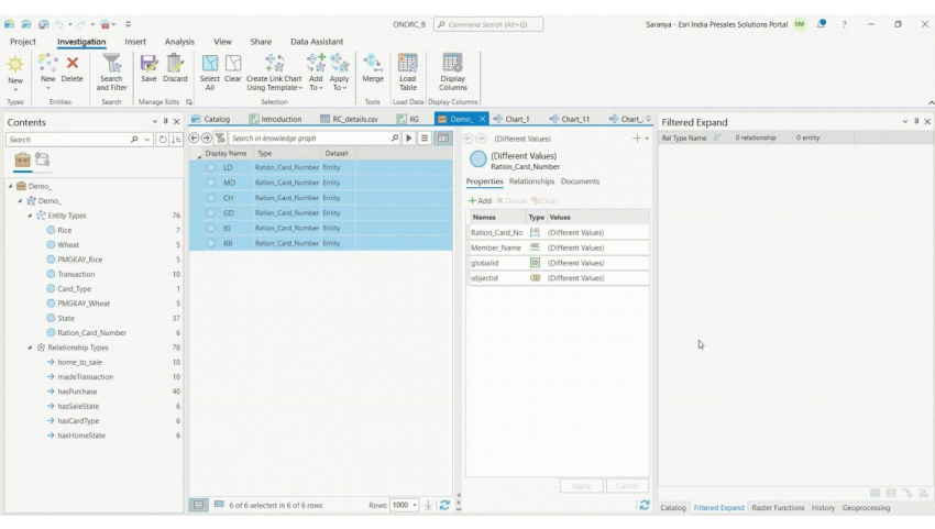
Let’s us take a subset of six Ration card holders’ data and add it to the knowledge graph.
-
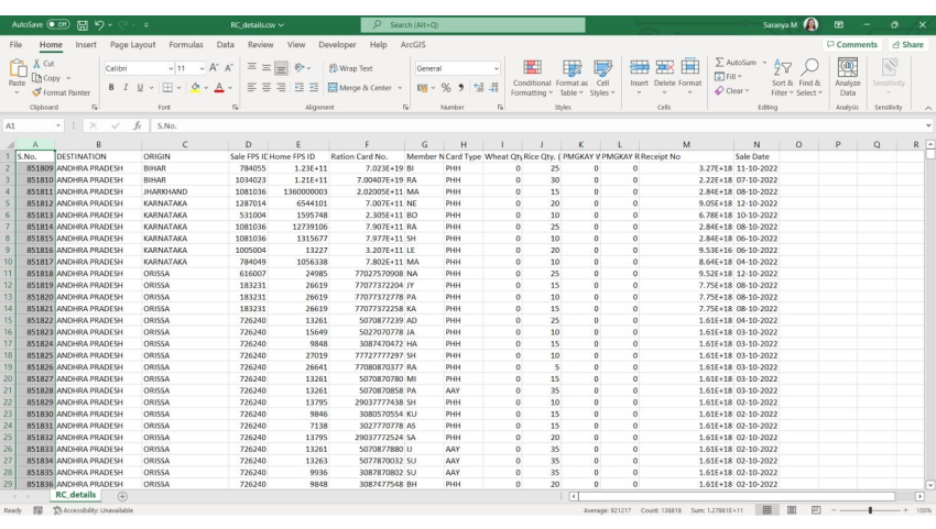
Sample Ration Card Transaction Data(Some details are modified/masked to protect the privacy of the citizens)
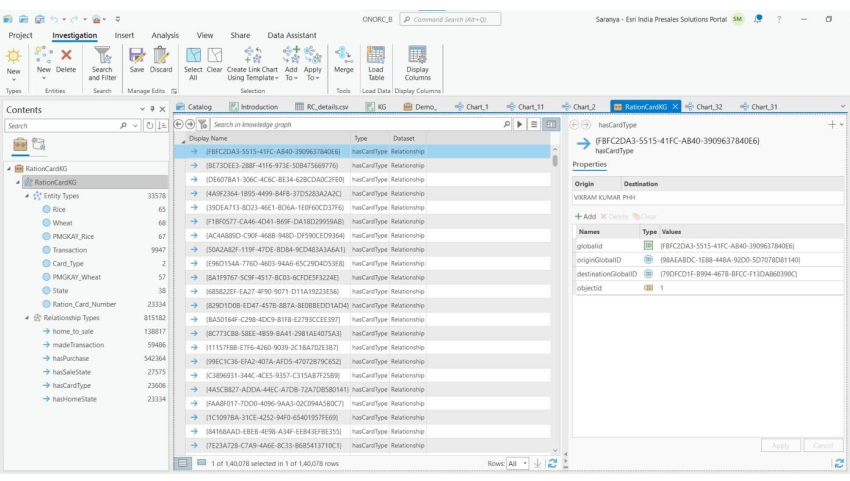
ArcGIS Pro has tools which allows users to explore this Knowledge graph and answer several questions. For example, we can expand the graph to understand what is their home state? What is their sale state? We can keep going on even up to the level of transactions – when did they buy & what did they buy? We can query the graph to filter out if they are beneficiaries of PMGKY using “Select by Attributes” tool within Link charts.
Because we are using ArcGIS Knowledge, we are not limited just what’s in the Knowledge Graph itself. We can switch right back to the map & take the geospatial perspective into account.
-
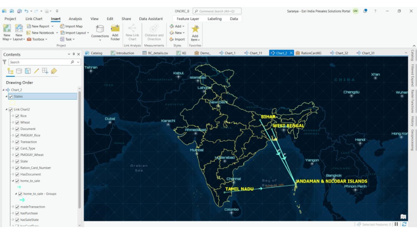
Figure-5
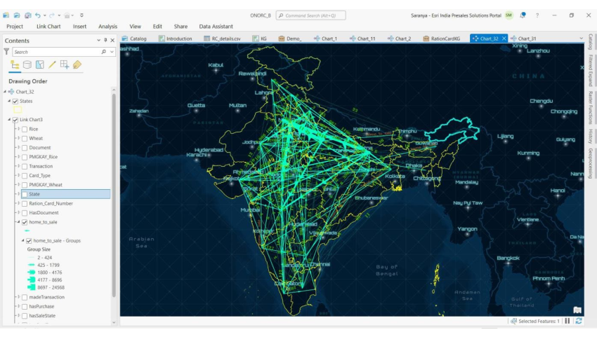

Using load data functionality, we can populate the existing knowledge graph with more data and extend this analysis to understand migration patterns in our country.
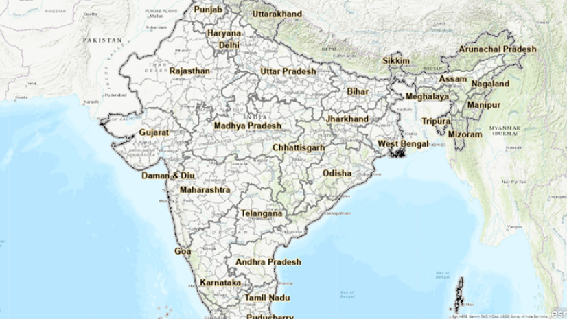
Here we have the lines extending from home state to sale state and the number of transactions as labelled numbers.
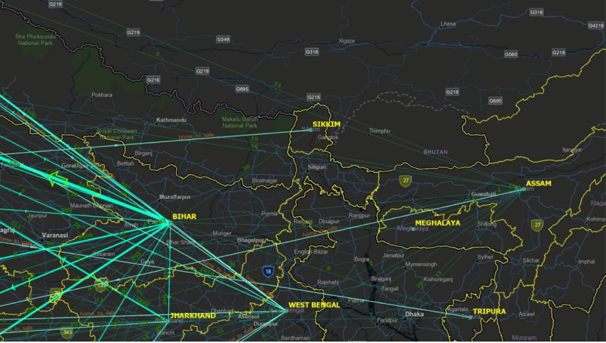
We can see a high inflow to Haryana from Bihar & Uttar Pradesh. We can also observe, Assam has outflows and very minimal inflow.
There is not much movement of migrant labourers within the Southern states.
This type of analysis will help our policy makers ensure there is no gap between supply & demand.
This is just one example of using this technology. It can be applied in a lot of fields like if we are managing a network of assets or investigating crimes or examining spending patterns. This hybrid approach to understand your data can help us make more informed, data driven decisions.
Additional Resources:
See the following links for more information regarding ArcGIS Knowledge:

I am an Assistant Manager on the Presales team focused on helping users better understand GeoAI in ArcGIS.