Policy Maps concept is a unique effort by the mapping community to bridge the spatial data gap in the policymaking domain. These concept maps are the need of the hour for a country like India. These include maps related to population density, demography, building density of major cities, transportation etc.
Maps themselves indicate tons of information. However, these could be made more effective by following and implementing some of the recent visualization techniques introduced in the ArcGIS Online. The current blog will highlight few techniques on how to bring focus to policy maps. Map Viewer will be used to demonstrate techniques like Effects, Blending and Filtering. To start with, we will concentrate on a policy map for the city of Bengaluru using percentage impervious surface layer data ( https://sedac.ciesin.columbia.edu/data/set/ulandsat-gmis-v1). We have carried out data transformation and this data has been aggregated at ward level.

Emphasizing a thematic map
Filtering, being an old school technique, is by far the most useful technique to emphasize an area of interest. In the recent ArcGIS Online release, a new capability called Effect has been added. These techniques will bring photoshop-like capabilities to maps. These effects can be used on all operational layers and basemaps.
A user must simply click or select the layer to enable these effects. This will activate the vertical pane enabling Effects button. On click (Effects button), a panel containing effects will be opened as shown in the Figure 1 below (all 4 steps are in the image).
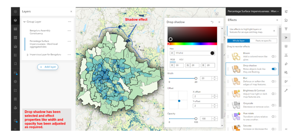
The Effects panel has various options like Drop shadow, Bloom, Blur etc. as shown in Figure 1. These effects can be applied for Whole Layer or Feature-specific. A toggle button has been provided to enable or disable. Once enabled, the properties related to Effects are visible. Use the slider or type in new values. As you adjust the properties for the Effects, the layer will update in real-time. These effects can also be re-ordered based on preferences and narratives. Figure 2 gives the glimpse of the operation.
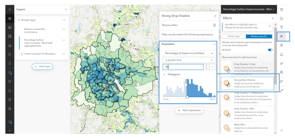
Effects shown in the panel are for the Whole layer. There is an option to apply Effects to features. This feature specific option needs a column in the data to apply filters. Users can set filter using an expression. These expressions are based on what users want to emphasize and put forward a specific narrative. Figure 3 shows Feature-specific filtering (above Percentage Impervious Surface > 50) with the effect of Strong Drop Shadow.
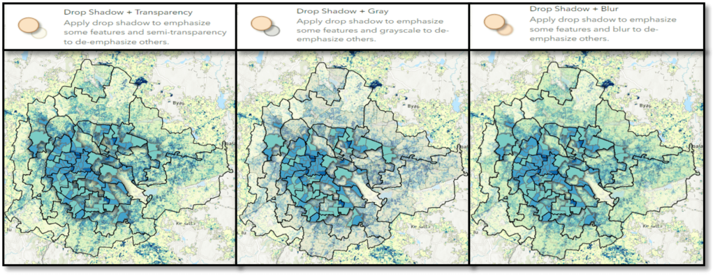
Similar Effects can be added based on the requirements and narratives. Below images (Figure 4) shows the three different Feature-specific Effects.
-
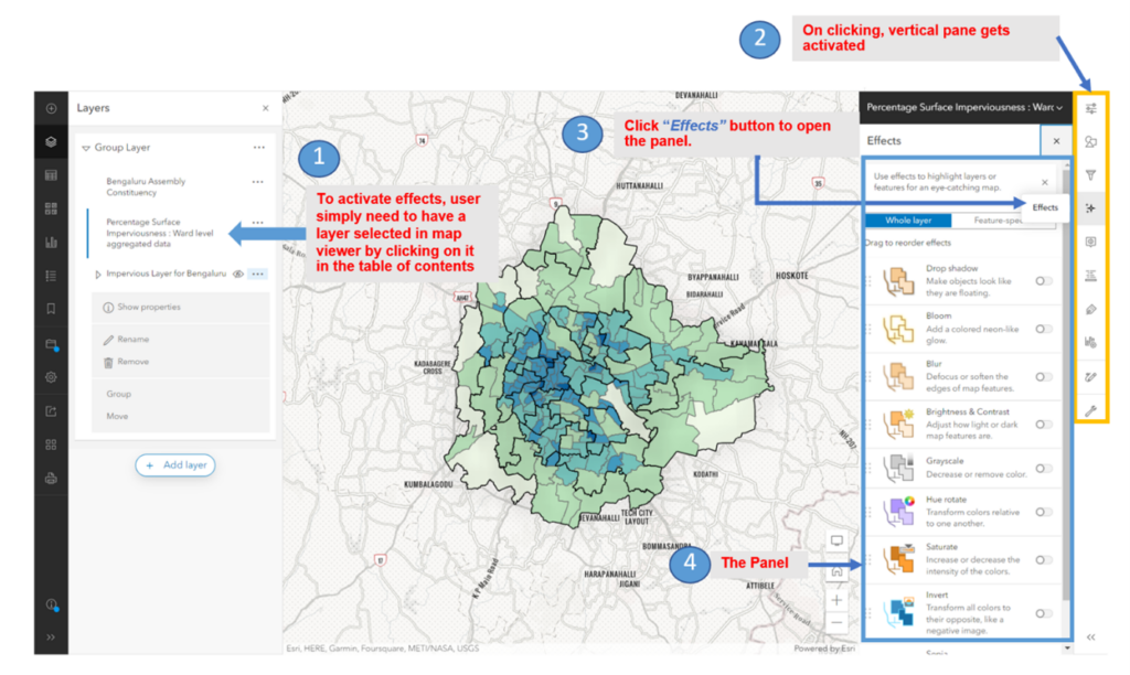
Figure 1 : Effects pane
Map Blending
Blending maps is one of the most interesting ways to highlight the data. Blending will work on both vector data and thematic rasters. Blend modes allow greater control over what is shown through and how colors and textures are shown between the layers. Blend modes need two map layers to work. In the example below, a raster layer and a vector layer have been used.

Blending method will not only emphasize the thematic pattern but also focus it to the area filtered. To do this, all the layers should be grouped as shown below.
To create blending (activity shown in Figure 6), Percentage Surface Imperviousness: ward level aggregated data is used along with impervious map layer. Destination In is applied for top layer (Percentage Surface Imperviousness: ward level aggregated). Similarly for the impervious map layer, Destination Atop is applied. The resulting map is the blended map as shown in Figure 6b.
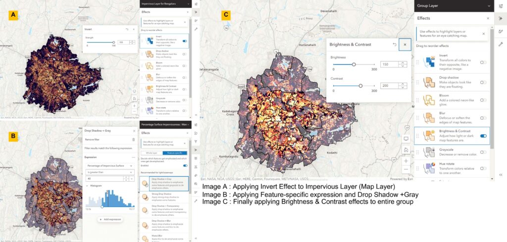
Once blending is done, we can perform more effects on the blended map. Following are the effects that were applied:
Step 1: Applying Invert Effect to Impervious Layer (Map Layer). Result is image A of Figure 7.
Step 2: Applying Feature-specific expression and Drop Shadow +Gray. Result is image B of Figure 7.
Step 3: Finally apply Brightness & Contrast effects to the entire group. The result is image C of Figure 7. Image C of Figure 7 is the final image that emphasizes the wards with % imperviousness above 40. All other wards are grayed out due to the applied Effects.
-
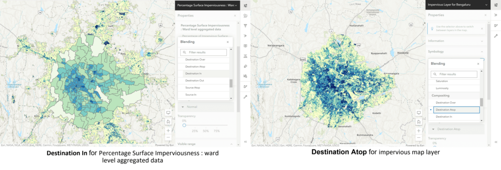
Figure 6
Key Take Away
The techniques mentioned in this blog will help you to emphasize various patterns using Effects and Blend. This will be like highlighting the concerned area without performing any analysis. These effects do not create any additional layer and are applied on the fly to the map layer. As these effects work on all the map layers, be it users’ data or publicly available Living Atlas data, creating Best and Beautiful Policy Maps has become more interesting and easier.

I am an Assistant Manager on the Presales team designing India-specific GIS solutions for our customers.